Analyzing big data is great, but not if you can’t share your results. In this course, Charlie Hadley shows how to create interactive presentations of large data sets with R, RStudio, and Shiny, an R-based tool for producing interactive, web-ready data visualizations. Learn why these tools are important to data scientists, how to configure and install them, and how to use them to make your findings more clear and engaging.
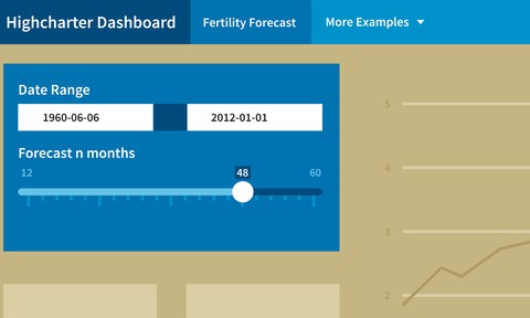
Discover the different types of presentations you can make right out of the box with R Markdown templates (built right into RStudio) and how to customize the templates with CSS. Find out how to register for RPubs to deploy RStudio presentations for sharing, and then go beyond the basics with Shiny—adding interactivity and creating embeddable dashboards without the need for HTML or JavaScript.
This is an exciting course for analysts who want to increase the relevance and visibility of their work. Make sure to watch the knowledge checks at the end of each chapter to test your new skills.
Learn More

